


Comparing lease bonuses across counties using your subscription
When mineral-rights investors evaluate U.S. acquisition opportunities, the per-acre signing bonus is usually the first number on the spreadsheet. Yet two neighbouring counties with identical geology can post strikingly different bonus figures because of competing operators, pipeline take-away constraints, or local leasing cycles. A subscriber working from Brisbane or Perth needs tools that translate raw permit chatter into clean, side-by-side comparisons, and that is precisely where an interactive mapping platform earns its keep.
The subscription unlocks the deeper layer set: per-county lease offer history, parcel-level mineral rights, pipeline diameters, and downloadable reports. Rather than scrubbing county recorder websites one tab at a time, an investor can isolate a basin, pull the bonus data, and overlay the supporting infrastructure in the same view. For Australian readers juggling multiple time zones, that single-pane workflow saves hours each week.
Below is a walk-through of how to use the data layer set to compare lease bonuses across counties, with examples drawn from operators and consultants who balance Queensland's Surat and Bowen basins against the U.S. shale footprint.
Understanding lease bonus mechanics before you compare
A lease bonus is the upfront payment a lessee makes to a mineral owner for the right to explore and produce over a primary term. In Australia, Santos and Origin price CSG bonuses per hectare under Queensland's Petroleum and Gas (Production and Safety) Act. Across the United States, the same principle applies per net mineral acre, but the dollar figure swings dramatically by county, by play position, and by competing operators.
Normalise the bonus against several variables before drawing conclusions: depth of the target formation, prevailing royalty rate, primary term length, and any non-participation clauses. A $3,000-per-acre bonus may look generous until compared with a neighbouring county offering $5,500 with a three-year term and 22.5% royalty. The point is not to chase the highest headline number, but to weigh it against the full contractual package.
Geographic context matters as much as the dollar value. A county with strong pipeline access and active permits typically commands higher bonuses because the probability of a producing well is greater, while a neighbouring county with the same geology but no take-away capacity may see bonuses compressed by 30 to 40 percent.
Setting up a clean comparison workspace
Open the Shale Navigator main map and select the basin or play you want to analyse. Most Australian users tracking U.S. opportunities focus on the Permian, Eagle Ford, Bakken, or Haynesville, but the same workflow applies to any mapped play. Toggle on the lease offer layer from your subscription menu so historical and current bonus figures render as colour-coded parcels or county aggregates.
Use the county boundary tool to draw a multi-county selection: one core, one tier-two, one fringe. This mirrors how Woodside analysts rank CSG acreage in Western Australia — they rarely look at one parcel in isolation.
Save the selection as a named project so you can return to it after each operator announcement. The subscription tier stores unlimited projects, useful when running parallel diligence on three or four basins while keeping tabs on a home portfolio in Adelaide or Sydney, and it makes sharing screenshots with co-investors much easier.
Layering pipeline, permit and lease data for context
A bonus figure alone is a snapshot. To understand whether it reflects a one-off auction or a sustained trend, stack additional layers on top of the lease offers. Open the pipeline layer and inspect the diameter and capacity of gathering lines crossing each county. A county with two independent 16-inch gathering systems leaving its eastern border will consistently outperform one served by a single 10-inch line, and that infrastructure premium shows up directly in the bonus grid.
The drilling permit layer adds another dimension. Counties with high permit density signal that operators are willing to commit capital, which usually pushes bonuses up. Counties where permits cluster around a single operator tell a different story: the bonus may be inflated by that operator's strategy and could collapse if drilling cadence drops. Comparing the bonus table against the permit map often reveals whether the headline number is supported by fundamentals or by competitive bidding alone.
For users researching specific basins, the Permian New Mexico permit guide walks through how to read permit vintages on the map and understand the lease cycles in the Delaware sub-basin. Applying the same habit of layering helps you see, for example, that Eddy County's elevated bonus averages correspond with consistently high permit issuance, while neighbouring Lea County shows more volatility because two operators dominate the activity.
Filtering for signing bonus terms and acreage context
Once the layers are stacked, refine the comparison using the filter panel. Set the bonus-per-acre range to bracket the observed county averages, then filter by primary term length and royalty rate. A $4,000 bonus with a five-year term and a 20% royalty is a very different deal from a $4,000 bonus with a two-year term and a 25% royalty.
Look at parcel size while you filter. U.S. counties often contain a mix of section-sized parcels (around 640 acres) and irregularly shaped splits. Bonus averages can be skewed by a few large institutional lessors in one county, so filtering by parcel size removes that distortion. Australian investors accustomed to Queensland's larger pastoral lease blocks will notice the much smaller U.S. parcel scale, which actually makes county-level comparison more granular.
Pay attention to the "excluded formations" or "depth clauses" tags in the lease metadata. A county where leases exclude the deeper Wolfcamp D may show lower bonuses than a county with full-stack rights, because the buyer pool is smaller. The subscription's metadata tags surface these structural differences automatically, one of the clearest upgrades over the free tier.
Tracking play boundary changes as technology improves
One trap investors fall into is treating last year's county bonus table as gospel. Shale plays shift because of improved completion designs, longer laterals, and new source-rock interpretations. A county sitting outside the core today can move into the core within a single calendar year, and its bonuses will adjust accordingly. Subscribers who check the boundary-updates layer each quarter avoid buying into a county whose footprint has quietly contracted.
The platform tracks technological revisions through its insights library, including a useful checklist on play-boundary revisions that explains how core-area designations get redrawn after major step-outs or new completion designs. Reading that checklist alongside your county comparison keeps your diligence aligned with how operators currently think about acreage value.
For Australian readers, this mirrors the Surat Basin between 2015 and 2020, where improved frac designs pulled the economic fairway outward by 15 to 25 kilometres in some directions. The same dynamic plays out across U.S. basins, only faster. Subscribing to boundary-change alerts ensures you are not benchmarking against an outdated play map.
Building export-ready reports for stakeholders
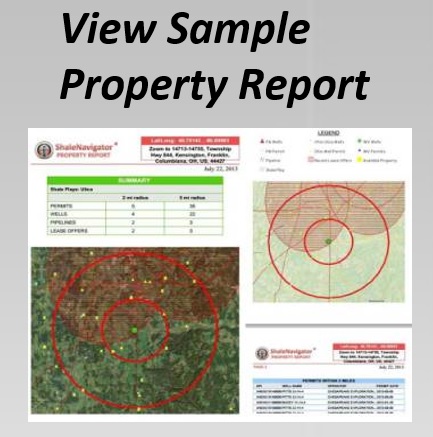
After the comparison, the report builder bundles the map view, bonus table, pipeline overlay, and permit chart into a single PDF or Excel deliverable. Australian funds typically require a one-page summary alongside the full data pack, and the templates handle that format out of the box. You can also generate a CSV of every lease offer in the selected counties.
When sending reports to co-investors or legal counsel, redact parcel numbers before sharing without a confidentiality agreement. The subscription's redaction tool blanks out owner names while keeping bonus and royalty data visible. That kind of feature is appreciated by a Sydney-based solicitor or a Perth-based joint-venture partner, because it shortens the back-and-forth on confidentiality before a deal moves forward.
Habits that sharpen county comparisons
A few habits consistently improve the quality of county-by-county bonus analysis.
- Refresh the lease offer layer weekly during active leasing windows, then monthly once the basin cycle cools.
- Compare at least three counties per basin to capture core, tier-two, and fringe dynamics.
- Cross-check bonus data against permit issuance counts from the past six months before drawing conclusions.
- Note royalty rates and primary term length in the same row as the bonus figure, not in a separate sheet.
- Save filter presets for each basin so new data renders consistently every time the layer updates.
- Flag any county where one operator accounts for more than 60 percent of recent permits, because the bonus trend there is fragile.
- Use pipeline diameter and capacity as a tiebreaker when two counties post similar bonuses.
Subscribers who follow these habits often spot genuine opportunities before they become consensus trades, frequently the difference between a strong entry price and a crowded auction.
Start a seven-day trial, open the lease offer layer on your county of interest, and run the comparison against two neighbouring counties today. Your subscription gives you the layers, the filters, and the export tools — the value comes from the diligence you bring to the workflow.