


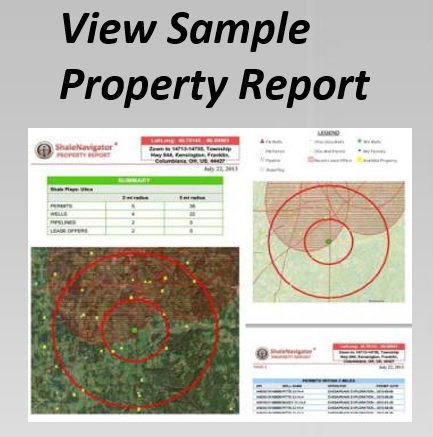
Build A County-Level Lease Bonus Heat Map
Lease bonus payments can reveal where operators are competing most aggressively for mineral rights. A county-level heat map turns scattered lease records into a visual market signal, making it easier to compare activity across shale plays, identify pricing clusters, and evaluate where new leasing may be developing.
The quality of the map depends on the quality of the underlying payment data. A high dollar amount may reflect a large acreage position, an unusual mineral package, a premium formation, or a transaction involving special terms. To make meaningful comparisons, you need to organize the records consistently before assigning colors to counties.
Shale Navigator provides mapping and reporting tools that can help users connect lease offers, property information, shale plays, drilling activity, and related infrastructure. The following workflow explains how to create a useful heat map while preserving the context behind each lease bonus payment.
Define The Payment Metric
Start by deciding what the map should measure. A simple version can display the average lease bonus paid per acre in each county. A more detailed analysis can use the median, highest reported payment, total bonus consideration, or a weighted average based on leased acreage.
The per-acre figure is usually the most practical metric for comparing counties with different transaction sizes. Calculate it by dividing the reported lease bonus by the net mineral acres covered by the agreement. Keep total consideration and acreage in separate fields so you can review whether a high per-acre result came from a small, highly competitive tract.
Choose a time period before collecting records. A twelve-month map may show current leasing conditions, while a three-year view can reveal broader trends. If the market changed sharply during the period, create separate snapshots by year or quarter instead of combining all payments into one number.
Assemble And Prepare The Data
Collect lease offers, recorded agreements, mineral-rights information, county boundaries, and relevant property records. Shale Navigator’s data resources can help users locate datasets and supporting information for a more complete county comparison. The appropriate subscription level may depend on the required records, geographic coverage, and reporting features.
Create consistent fields for county, state, formation, operator, transaction date, gross acres, net mineral acres, bonus amount, bonus amount per acre, royalty rate, and source. Include a confidence or verification field when records vary in completeness. A payment with a clear filing date and acreage description should not be treated exactly like an unverified market report.
Clean the county names before mapping. Abbreviations, alternate spellings, and county-equivalent names can cause the same location to appear as several separate areas. State information is equally important because county names can repeat across state lines. Use a standard county identifier where available, and retain the original record name for auditing.
Normalize Lease Bonus Payments
Normalization makes the heat map more representative. If one record reports a total bonus and another reports a per-acre amount, convert both into the same unit. Confirm whether the acreage is gross or net, and avoid dividing by gross acreage when the payment applies only to a smaller mineral interest.
Consider separating transactions by formation or play. A county may contain several prospective intervals with different economics, and one combined value can hide those differences. Filtering by shale play, formation, operator, or lease date allows you to create a map that answers a specific market question rather than presenting an undifferentiated average.
Outliers deserve review rather than automatic deletion. A very high bonus may reflect a strategic position near a gathering system, a development unit, or a known productive well. A very low amount may involve nonproducing acreage, old terms, title uncertainty, or a limited leasehold. Flag unusual values, inspect the source, and document the reason for retaining or excluding them.
Configure The County Heat Map
Load the county boundary layer and join it to the cleaned payment dataset using the standardized county identifier. Select a color scale that communicates increasing lease bonus values clearly. A sequential scale works well when the values move from low to high, while a diverging scale can highlight counties above and below a selected benchmark.
Use classification carefully. Equal-interval categories are easy to explain, but they may place most counties in one color when payment values are unevenly distributed. Quantile categories create a balanced number of counties in each color group, while natural-break classifications can expose genuine clusters. Test more than one method before deciding which version best represents the market.
Add context layers beneath or beside the heat map. Shale play boundaries show whether high payments are concentrated within a target formation. Drilling permits and producing wells can indicate whether lease pricing corresponds with development activity. Pipelines, processing facilities, and available mineral rights may help explain why neighboring counties have different values.
| Map Element | Purpose | Useful Display Choice | Review Question |
|---|---|---|---|
| Lease bonus per acre | Compares payment intensity | Sequential color scale | Which counties command the highest normalized payments? |
| Transaction count | Shows data density | Graduated symbols or labels | Is the county result based on many records or only a few? |
| Net mineral acres | Provides market scale | Tooltip field or secondary report | Does acreage volume support the apparent trend? |
| Shale play or formation | Separates geological markets | Boundary overlay or filter | Are different formations being combined? |
| Drilling permits and wells | Adds development context | Point layers with subdued styling | Does leasing correspond with active operations? |
| Pipelines and infrastructure | Shows access and logistical value | Line layers with clear hierarchy | Could midstream access influence bonus pricing? |
Interpret Patterns With Care
A dark-colored county indicates a high value under the selected calculation; it does not automatically indicate the best investment opportunity. A county with a high median and only two reported transactions may be less reliable than a county with a slightly lower median based on dozens of leases.
Compare the map with transaction counts, dates, acreage, royalty terms, and formation filters. A county’s apparent decline may result from newer records being smaller or from a shift toward a different formation. Reviewing the underlying records through map popups or reports helps distinguish a genuine pricing change from a data composition effect.
Market structure can also affect the pattern. Mergers, acquisitions, and portfolio transfers may alter how lease offers are recorded or reported. Background on mergers and acquisitions can help explain why historical lease-offer data may show discontinuities that are not caused by geology or operator demand.
Apply The Map To Real Decisions
A custom heat map is most valuable when it supports a specific workflow. Landmen can use it to prioritize counties for title research and outreach. Mineral-rights investors can compare reported lease values with available acreage and nearby development. Engineers and operators can examine whether lease pricing aligns with infrastructure and planned drilling.
For a defensible report, save the filters, date range, classification method, and source notes used to produce the map. Record whether the calculation uses mean or median values, how missing acreage was handled, and which records were excluded. This documentation makes the analysis easier to update and easier for attorneys, clients, or internal reviewers to evaluate.
Use these practices when building and maintaining the map:
- Normalize every payment to a consistent per-net-acre measure before assigning county values.
- Display transaction counts beside payment values so sparse counties are not mistaken for established markets.
- Filter by formation, play, operator, and date when the county contains multiple leasing environments.
- Review unusually high or low records against acreage, royalty, source quality, and transaction terms.
- Refresh the map regularly as new lease offers, permits, infrastructure, and property records become available.
A useful heat map should lead to the underlying evidence, not replace it. Select a county with an unusual color, inspect the lease records behind the value, and compare those records with nearby activity. The combination of spatial pattern and transaction-level detail produces a stronger basis for negotiations, acquisition screening, and market monitoring.
Create a free seven-day Shale Navigator account to begin exploring county boundaries, lease offers, drilling permits, mineral-rights data, and related map layers. Build the first version around a clearly defined payment metric, validate the results against the source records, and turn the finished map into a repeatable leasing intelligence workflow.